
Introduction
Hi All, Hope you are fine. Today we will learn how we can hide a particular DIV element when the site is viewed in Mobile. I hope you will like this.
Background
For the past few days I was working in my personal website. Suddenly I found out an issue that my site’s footer is bothering when the same is viewed in mobile. So I started working on this issue and I could resolve it. So here I am going to share the fix you need to do.
Using the code
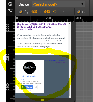
Previously whenever I view my website in mobile, I got a view as shown in the below image, Which makes my site’s reputation go down. And as you all know now a days we are seeing everything in mobile. So it is must that we make our site looks better in mobiles also. What I am doing is whenever a user view my site in mobile, I will just hide my footer div which contains social plugins.

Here I will share you the CSS you need to implement.
[css]
@media only screen and (max-width: 480px) {
body {
max-width: 480px;
}
.myfootershare {
display: none
}
}
[/css]
What we do in the above CSS is, we are checking the width of the screen by using the @media query in CSS.
[css]
@media only screen and (max-width: 480px)
[/css]
So when the scree size is below 480 px, we will just hide the element (with class name myfootershare).
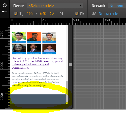
Once you include this to your CSS, you can see the output as follows when you see the site in Mobile .

That is all for the day. I hope you enjoyed reading.
Conclusion
Please share me your feedback.
Kindest Regards
Sibeesh Venu